
So Did You Actually Work with Temple University?
Yes! My class and I collaborated with Joe Bosack, Founder and Creative Director of Joe Bosack & Co. to create a new Temple Owls athletics team logo. We initially met with Temple University's Strategic Communication & Management team to understand Temple's athletics brand identity, tone, and goals of the assignment. My class also met with the iconic Stella the Owl, our school's real life mascot, to understand the anatomy and behavior of an owl in motion.

Temple University Strategic Communications and Management representatives presenting to our class about Temple's Brand Identity and project goals.
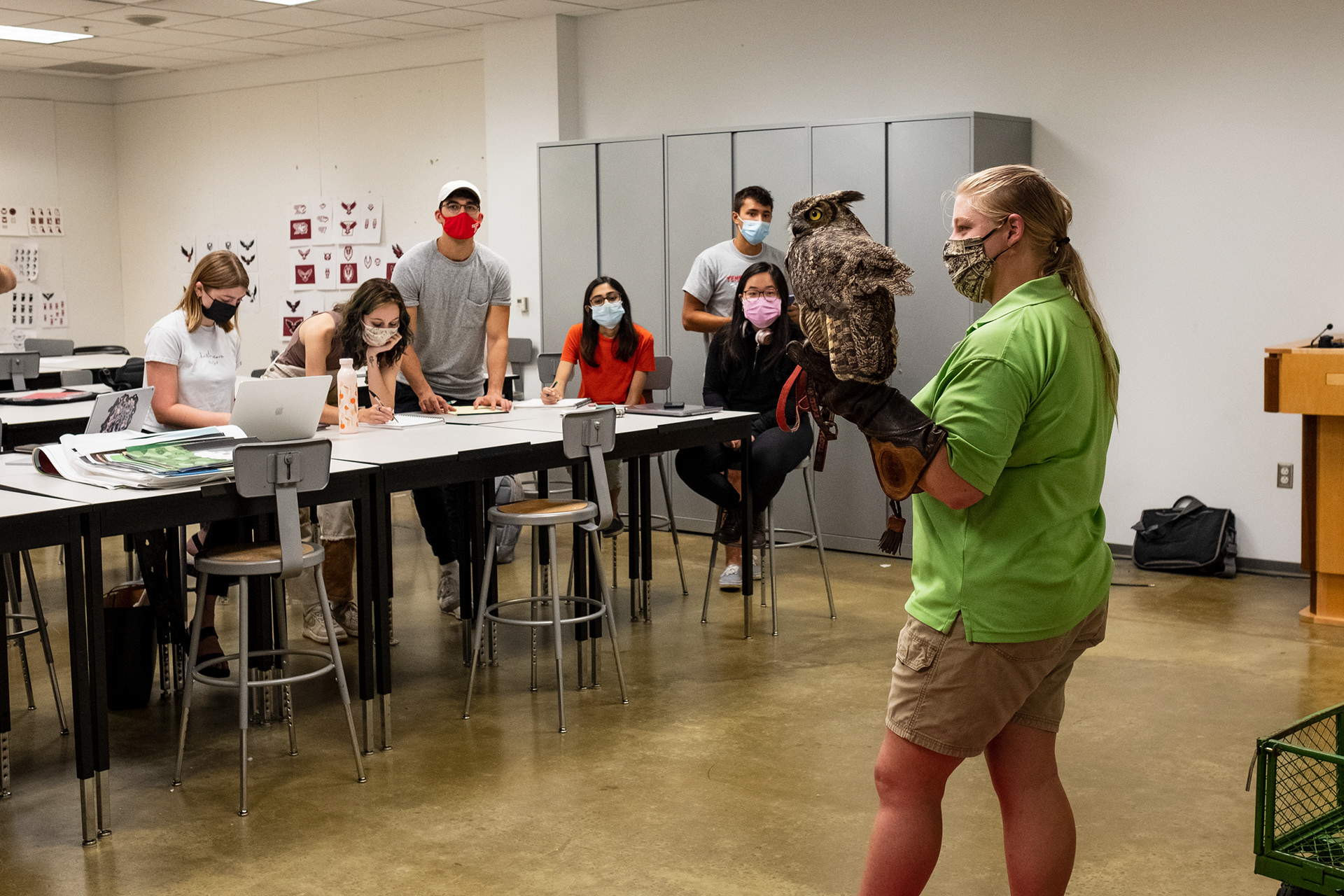
Stella the Owl visits the Tyler School of Art + Architecture Graphic Design Department for an anatomy study.
Why Is Temple Athletics Rebranding?
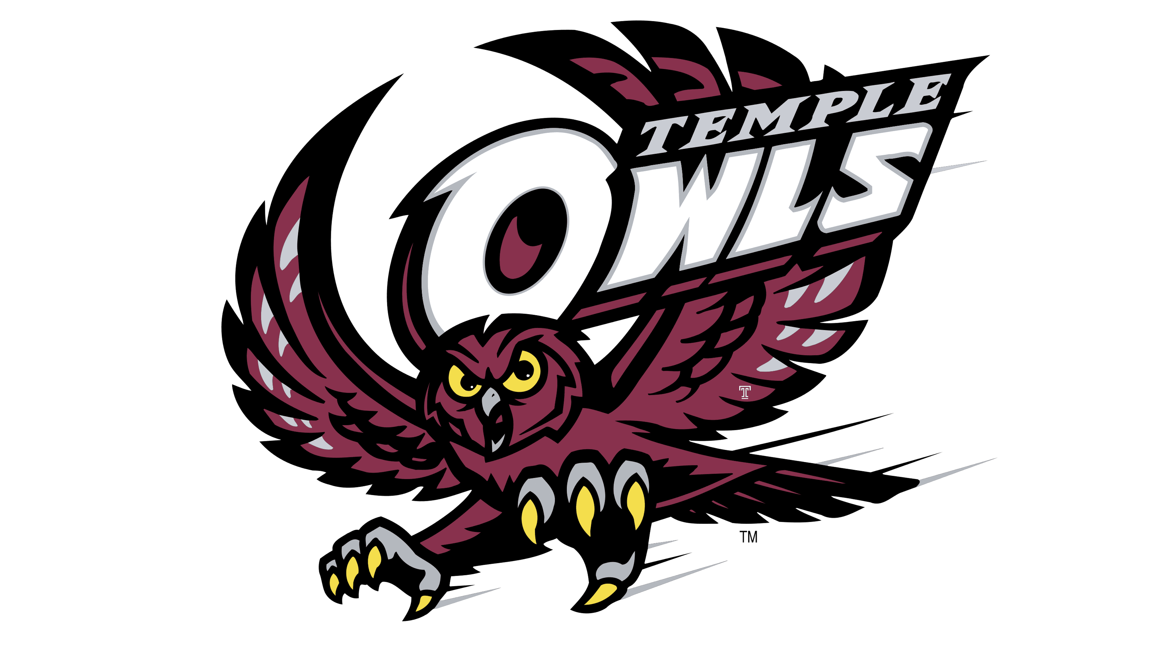
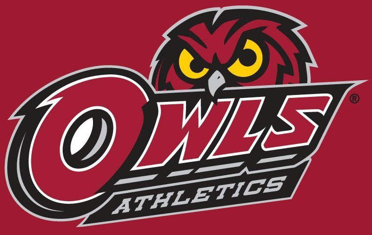
The bottom line is - the current logo is outdated, complicated, and inconsistent. The current owl can be found in four different lockup styles, has five different colors, and uses multiple different typefaces (none of which being the official Temple Athletics font). Too many logo variations decreases the brand's visual consistency, too many colors make it hard for the design to be printed, and a mix-match of typefaces creates confusion within the brand identity. All of these circumstances point to Temple Athletics needing a new fresh, clean logo that truly connects with Temple's branding.
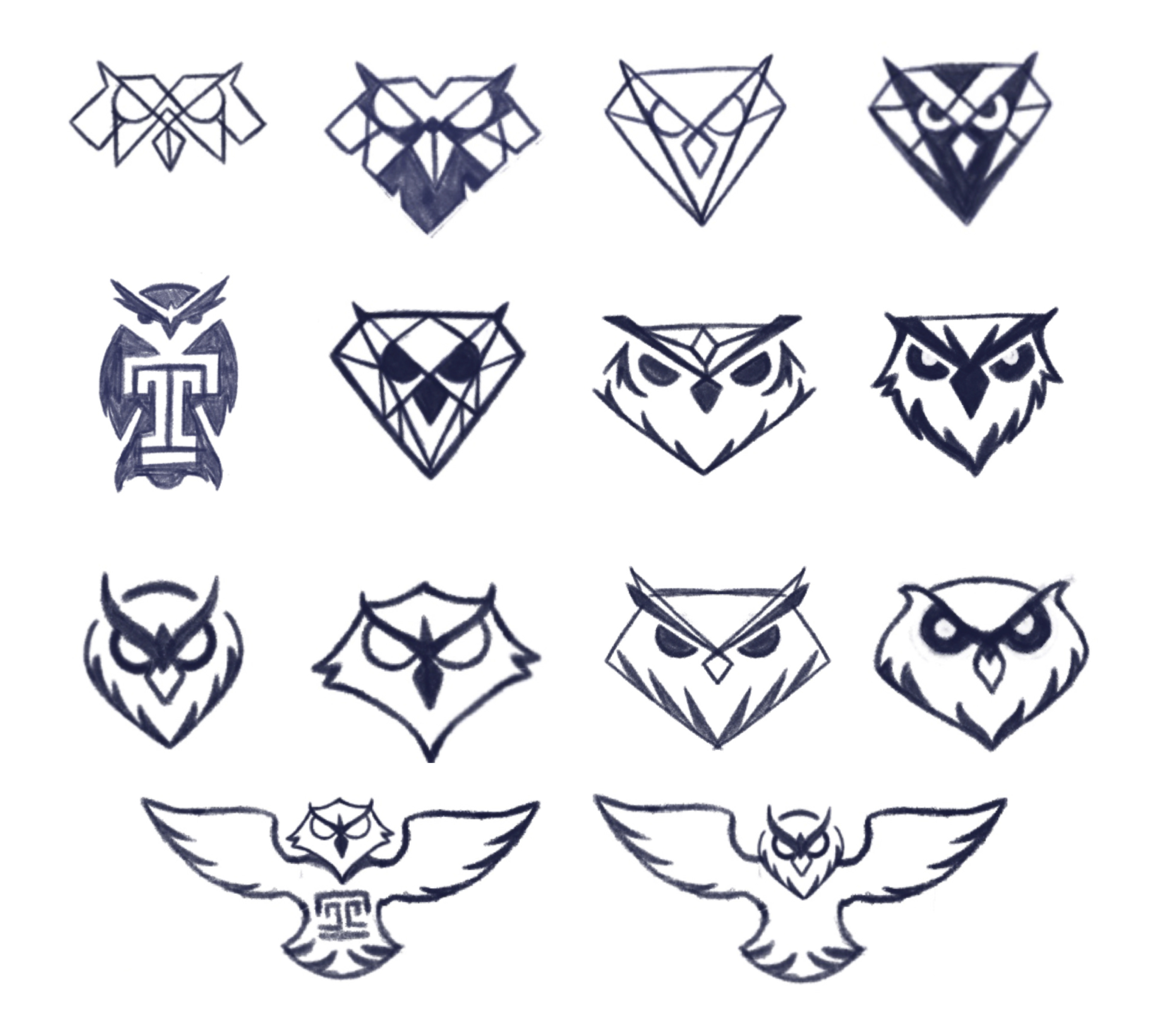
Initial Logo Sketches
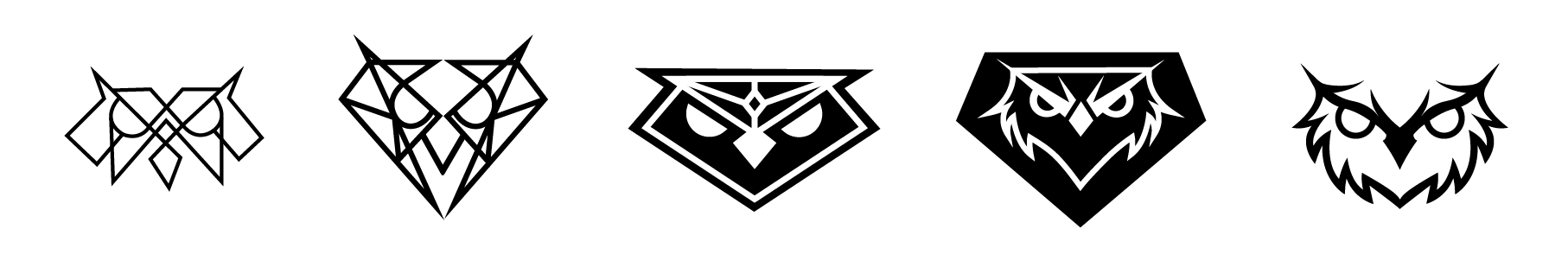
Revised Logo Ideas
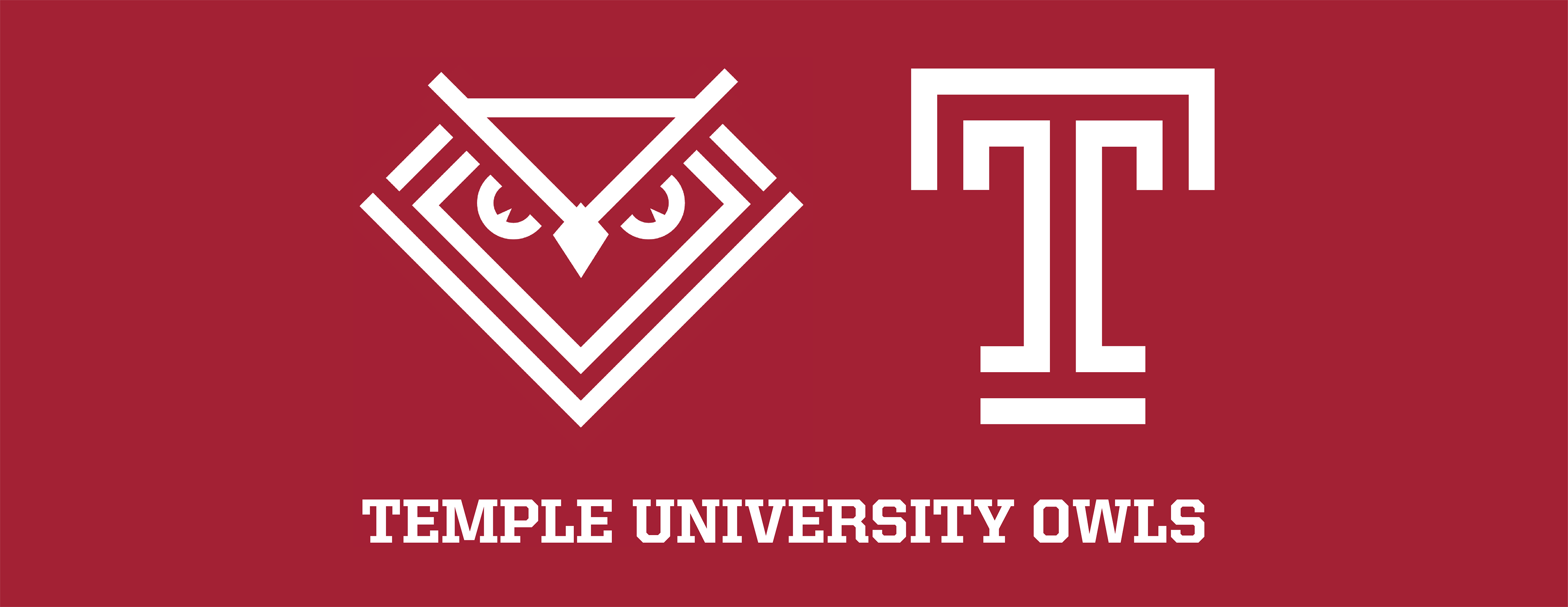
Why the Diamond?
I knew right away that I wanted to include the diamond shape because of the speech given by Temple's founder, Russell Conwell. The speech, titled "Acres of Diamonds," states that Conwell's method of success is to "Keep clean, fight hard, pick your openings judiciously, and have your eyes forever fixed on the heights toward which you are headed." The concept of diamonds is used throughout Temple's branding today, from our University currency "Diamond Dollars" to our cheerleading squad, the Temple Diamond Gems. Conwell's Speech and the diamond motif is deeply engrained in Temple's DNA, making it very important for me to include within the athletics logo. My classmates and I went through weeks of critique with Joe Bosack, solidifying our concepts, learning how to perfect and clean up our logos, and creating presentation-worthy designs to show to the board.

Joe Bosack (Left), Bryan Satalino (middle) and I reviewing my logo ideas.
How Did You Pitch Ideas?
After a few weeks of logo development, Joe brought his logo concepts to a board of Strategic Communications leaders, the head of the athletics department, and other influential brand managers. This was an informative part of the process because my classmates and I got to sit in on professional design presentations and hear the terminology Joe used to describe design decisions and see how he received feedback from the group.

My class and I attending one of many presentations to Temple's Strat Comm team and Athletics Department Leaders.
Are Those Patterns?!
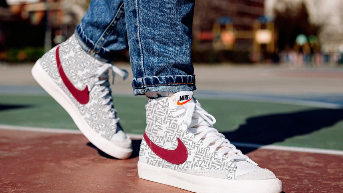
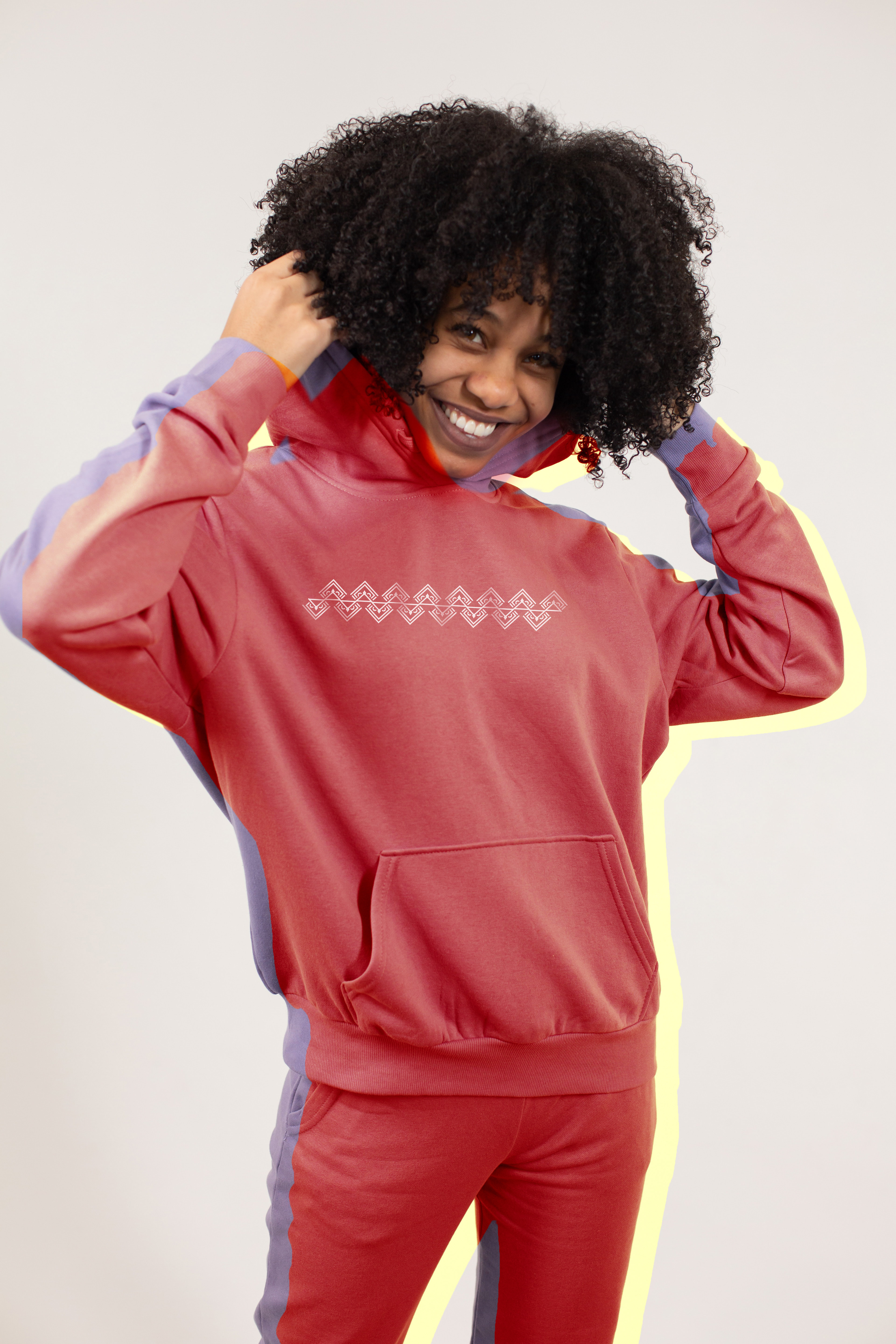
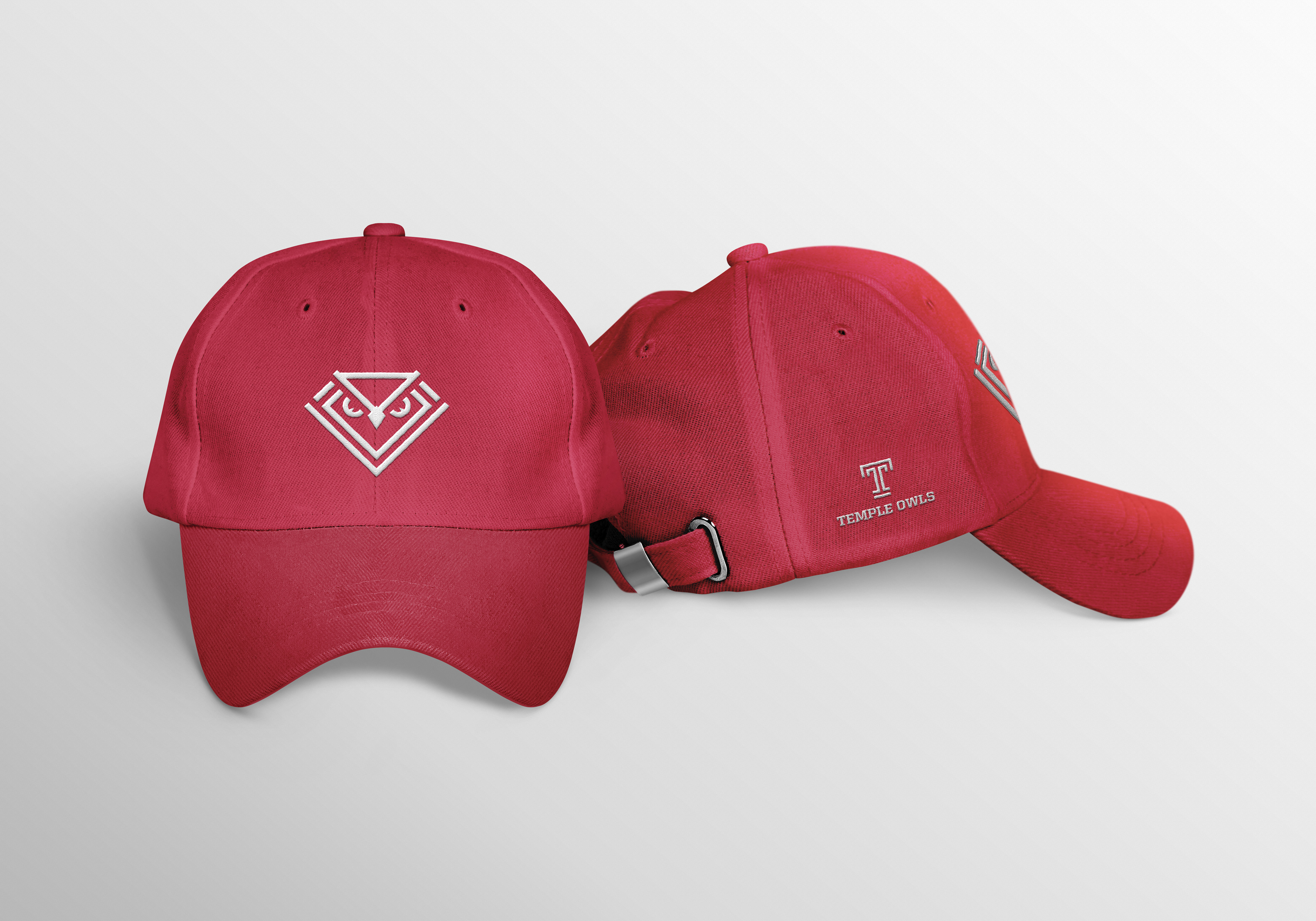
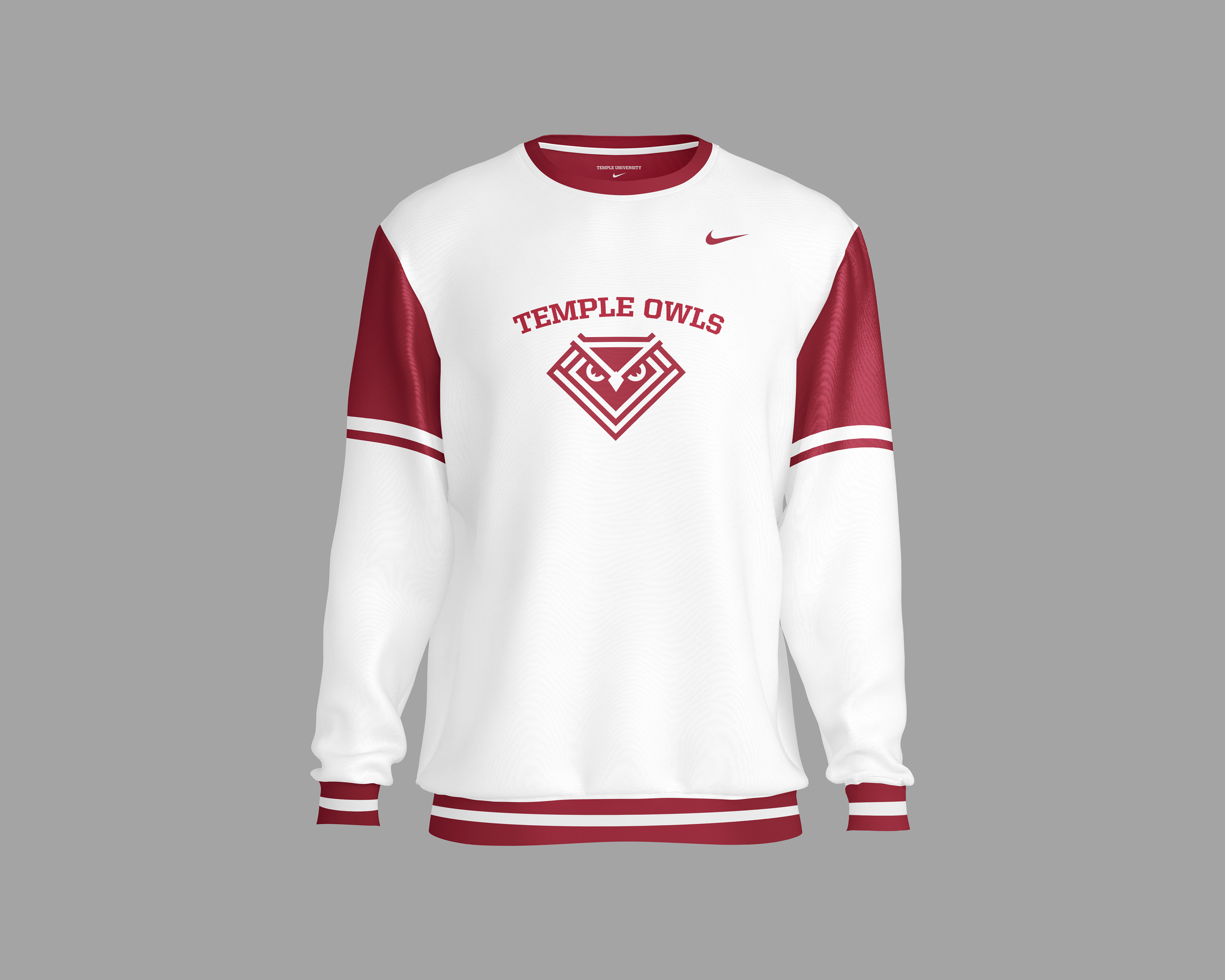
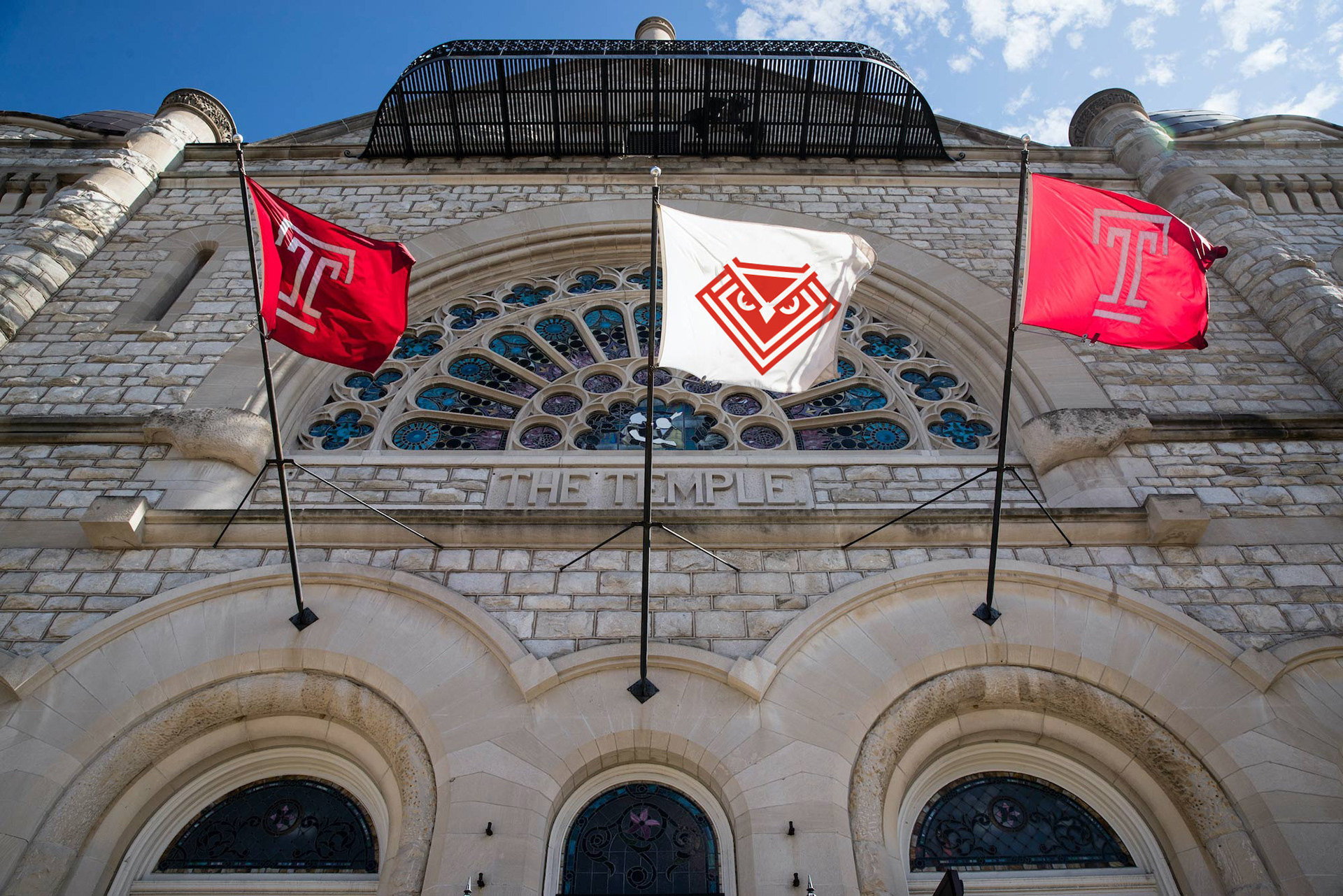
Oh yeaaa! The finalized owl logo contains the same DNA as the Temple "T," with its straight, evenly parallel lines. The geometric shape was developed into a minimalist logo that operates as white on a cherry red background or moves with a cherry red interior to maintain the design on different colored background. My design is an authentically unique perspective on Temple's existing bold and tenacious brand identity.
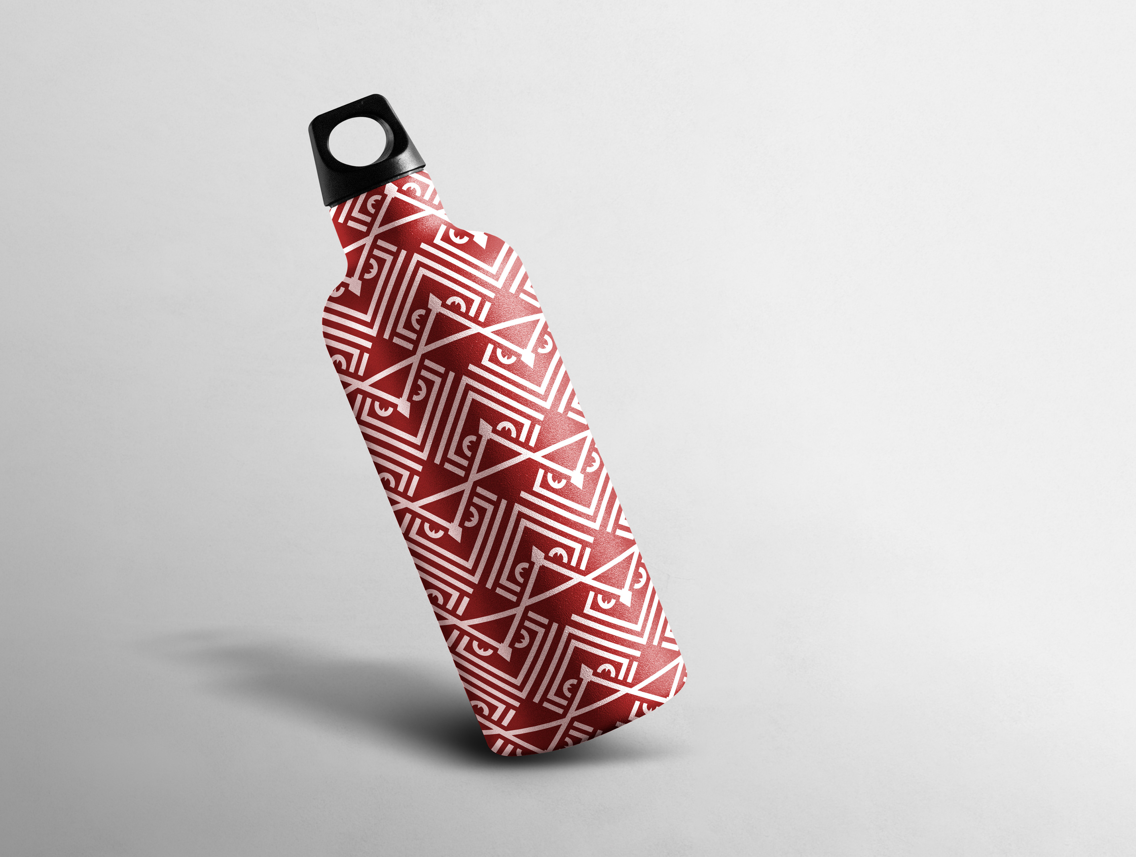
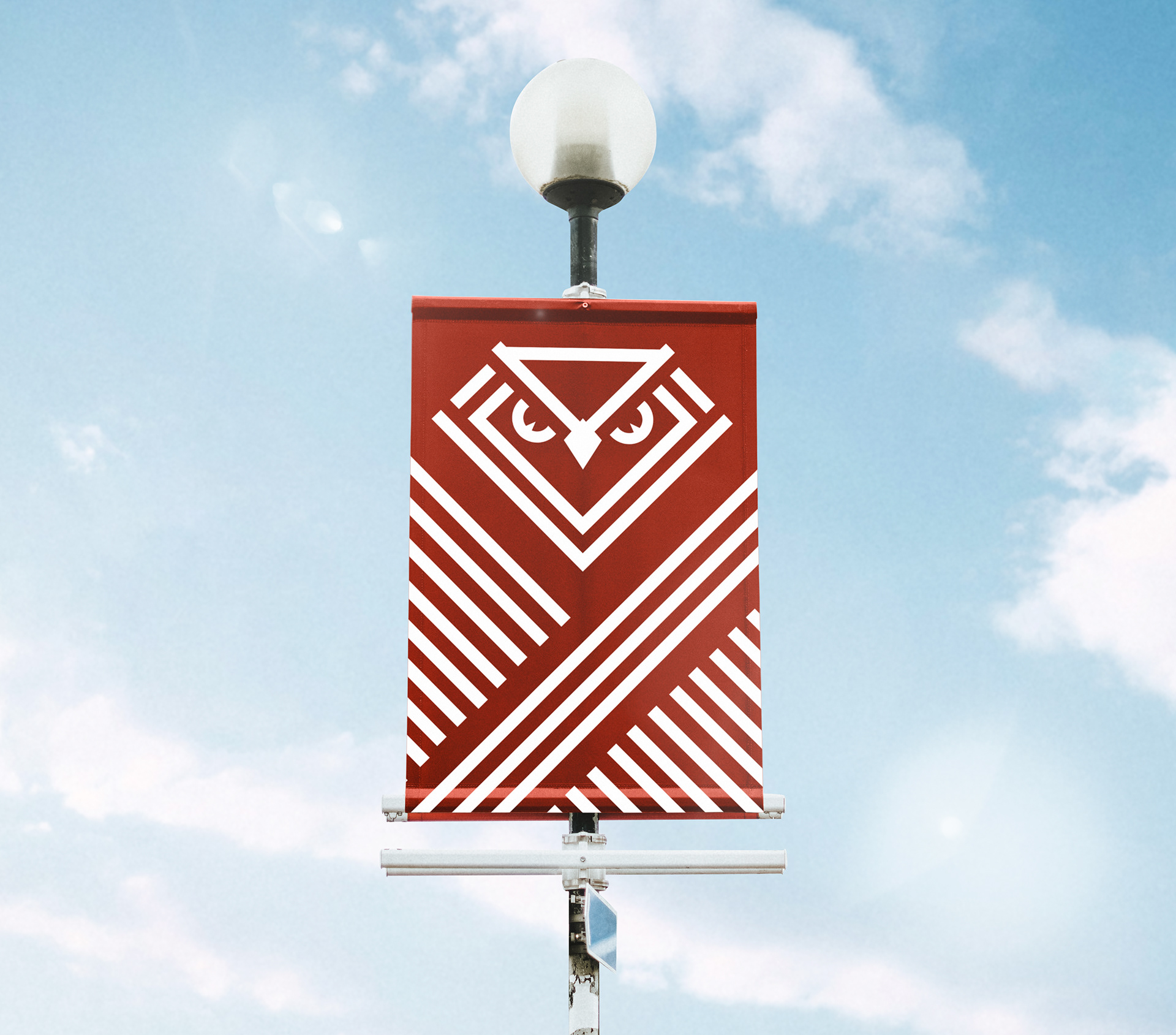
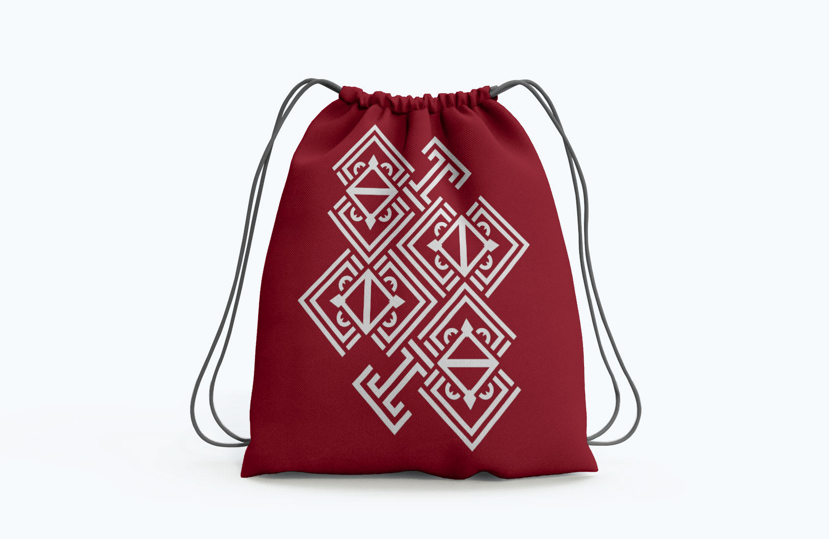
Since the logo is geometric with perfect 45 degree angles on both sides, the shape fits perfectly into an infinite array of patterns. Some patterns even include the Temple "T," solving the issue of many students simply buying Temple gear with the "T" instead of the athletics logo. The patterns allow for a plethora of unique collegiate gear to deck out any proud student from head to toe. Hats, sweatshirts, backpacks, water bottles, signage, you name it, we got it. Temple will no longer just be represented by the "T," but by the fierce athletic owl.


How Can We Implement This New Logo?
It was important for me to design collateral that I would personally wear, not just gear for the athletes. Although the logo is for the athletic departments, it should feel accessible to all students as a unique college logo that's worth flaunting on campus. Because of the variety of patterns, collateral can be ever-changing and growing to fit the design trends of the school year. The connective DNA of those perfectly spaced parallel lines evokes Temple's original "T" logo, making it feel related to the brand identity even without the presence of the "T."

Disclaimer: This work was not chosen as the official Temple Athletics Logo and exists solely as a fictional logo redesign.